How do you choose appropriate colors for a website?
Color selection in web design isn't just aesthetic. It influences branding, usability, and conversion rates. The right palette reinforces brand identity, enhances user experience, and guides visitor behavior. To choose effectively, you need to understand basic color principles, psychology, technical formats, and accessibility requirements.
What is the 3 color rule for websites?
Definition of the 3-color rule
The 3-color rule limits your design to three core colors: a primary, a secondary, and an accent color. This approach maintains visual clarity and hierarchy, making your site easier to navigate and more visually cohesive.
Examples of effective 3-color palettes
- Corporate: Navy (primary), light gray (secondary), lime green (accent)
- Creative portfolio: Charcoal (primary), soft white (secondary), hot pink (accent)
- Health brand: Sky blue (primary), mint green (secondary), orange (accent)
These combinations balance contrast, mood, and readability.
When to use the 3-color rule
Ideal for minimalist designs, landing pages, SaaS products, and startups. It simplifies decision-making and enforces brand discipline.
How do I choose a color code for a website?
RGB vs HEX: technical difference
RGB (Red, Green, Blue) uses numeric values between 0–255 to define color intensity. HEX is a six-digit hexadecimal representation starting with #. Example: rgb(255, 0, 0) is the same as #FF0000. HEX is more concise and generally preferred in CSS.
Using browser dev-tools to pick codes
In Chrome, right-click any element and choose "Inspect". In the Styles tab, click the color swatch to open a color picker. Use it to explore, copy HEX or RGB values, and preview changes live.
Saving and reusing your codes
Create CSS custom properties (variables) for consistency:
:root {
  --primary: #1A73E8;
  --secondary: #F1F3F4;
  --accent: #FBBC04;
}
Reference these across your stylesheet to keep branding aligned.
What is the 60/30/10 rule in design?
Applying 60% primary color
This dominant hue defines your overall tone. Use it for backgrounds, large containers, or main UI elements like headers.
Integrating 30% secondary color
The secondary color supports the primary by adding contrast or calm. Use it in navigation, sidebars, and section dividers.
Using 10% accent color
Accent is your highlight. Use sparingly on buttons, callouts, or icons. This small percentage maximizes impact.
What color attracts people to a website?
Color psychology overview
Color triggers emotion. Red excites. Blue builds trust. Yellow creates optimism. These reactions are often subconscious and affect user perception.
Top attraction colors by industry
- Finance: Blue (trust, security)
- Food & Beverage: Red and orange (appetite, urgency)
- Wellness: Green and teal (growth, balance)
- Luxury: Black, gold, and deep purples (exclusivity)
Choose based on emotional tone and brand promise.
How do I choose the right color for my website?
Align with brand identity
Your site should visually echo your logo and brand guidelines. Consistency across platforms strengthens recognition.
Test with your audience
Run split-tests on different color combinations. Collect user feedback to understand emotional impact and usability.
Ensure contrast and readability
Text must be legible against its background. High contrast ensures that users with low vision can still engage with content.
What color catches the eye first?
Understanding visual hierarchy
Human vision is drawn to brightness and saturation. Use these strategically to direct user flow. Brighter elements should signal important actions.
Common high-impact accent choices
- Red: urgency and alertness
- Orange: enthusiasm and energy
- Yellow: attention and warmth
Use these on key UI actions like "Sign Up" or "Buy Now."
How do I test color contrast for accessibility?
WCAG contrast ratio standards
The Web Content Accessibility Guidelines require:
- Normal text: 4.5:1
- Large text: 3:1
- UI elements: 3:1
Failing these standards can make your site unusable for people with visual impairments.
Free contrast-checking tools
- WebAIM Contrast Checker
- Stark (Figma plugin)
- Color Contrast Analyzer
These help ensure all text and elements meet legal accessibility standards.
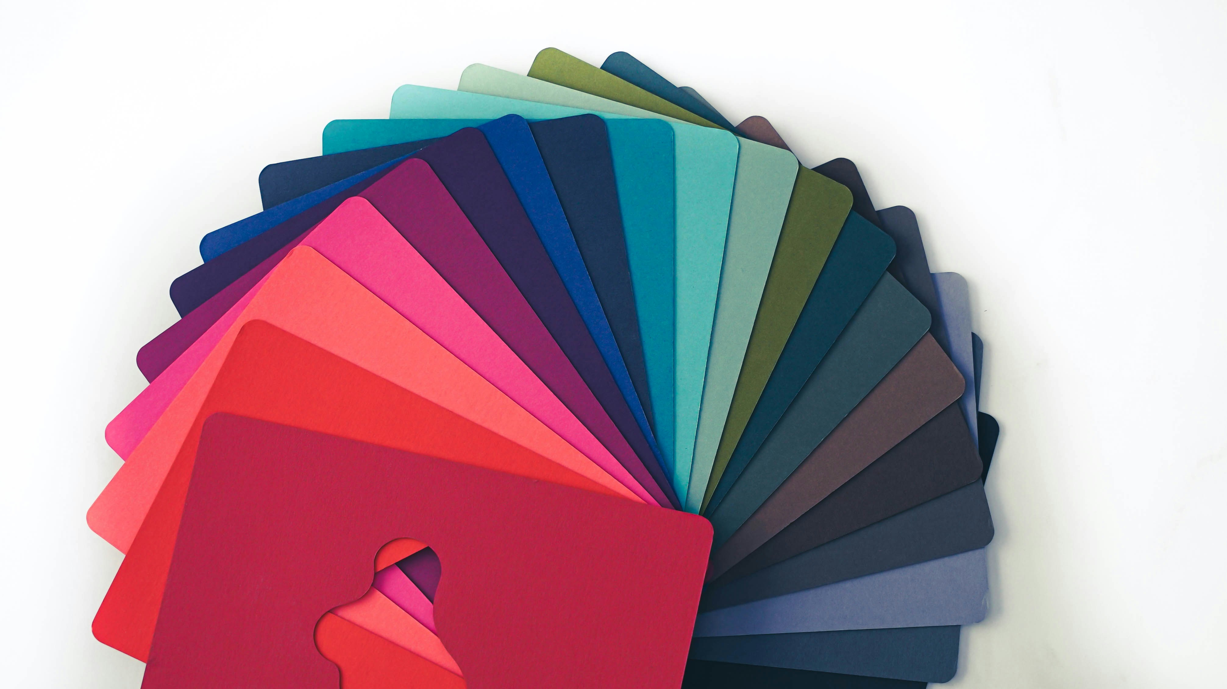
What tools help generate a website color palette?
Online palette generators
- Coolors.co: auto-generate and lock colors
- Adobe Color: explore color harmony rules
- Paletton: visualize schemes on web UI
Design-software features
Tools like Figma, Sketch, and Adobe XD offer built-in palette libraries, saving custom styles, and integrated accessibility testing.
How do I apply color psychology to web design?
Emotional associations
- Red: passion, danger, urgency
- Blue: calm, trust, stability
- Green: growth, safety, balance
- Purple: luxury, creativity
Choose emotions that align with your product or message.
Cultural and contextual factors
Color meanings vary globally. Red symbolizes good luck in China but signals danger in Western cultures. Always account for your target audience's cultural context.
What's the difference between RGB and HEX colors?
RGB: red-green-blue model
It's an additive system used in screens. Defined in numeric values:
rgb(0, 128, 255)
HEX: hexadecimal notation
A base-16 format that represents the same color:
#0080FF
HEX is more compact and used in most CSS and design tools.
How do I ensure color consistency across devices?
Color-management workflows
Use sRGB color space as the web standard. Avoid CMYK (which is for print). Calibrate your monitor and test color settings across design tools.
Testing on multiple screens
Preview your site on desktops, tablets, and phones. Compare on both budget and high-end screens. Adjust based on real-world variance.
How many accent colors should I use?
Balancing accents with neutrals
Use one main accent to focus attention. Neutrals (black, white, gray) support and balance. Too many accents dilute impact.
Industry norms and examples
Corporate sites typically use one accent for formality. Media sites may use two in muted tones. Avoid rainbow-like complexity.
How do I pick complementary versus analogous colors?
Color-wheel basics
- Complementary: opposite on wheel (red/green)
- Analogous: side-by-side (blue/teal/green)
Complementary creates contrast. Analogous offers harmony.
Harmonious combination examples
- Complementary: orange and navy for contrast
- Analogous: blue, aqua, green for calm
Use based on your site's tone and energy.
What role do neutral colors play in a palette?
Background and grounding uses
Neutrals are foundational. Use as backgrounds, containers, and whitespace. They let your brand colors shine.
Balancing bright and muted tones
Bright colors are energetic but tiring. Neutrals rest the eye and prevent visual overload.
How do I avoid color clashing on my site?
Maintaining contrast ratios
Always test light-on-dark and dark-on-light text. Watch for color blindness issues (especially red/green).
Limiting saturation extremes
Avoid placing multiple highly saturated colors together. It creates visual noise. Stick to 1–2 saturated hues maximum.
How do I create a dark-mode color scheme?
Inverting light palettes
Don't just flip white to black. Use dark grays for backgrounds and off-white for text. Pure black causes eye strain.
Ensuring text readability
Maintain WCAG ratios. Watch for low contrast on buttons and links. Add subtle shadows for visual separation.
How do I use brand colors effectively online?
Following brand guidelines
Stick to the defined HEX/RGB codes. Use official tints and tones. Align your site with business cards, ads, and social media.
Consistency across pages
Apply brand colors to headers, buttons, links, and footers site-wide. Don't switch color roles across pages.
How do I adjust colors for color-blind users?
Simulating color deficiencies
Use simulators like Coblis or Stark to preview deuteranopia, protanopia, and tritanopia. This reveals potential accessibility issues.
Choosing color-blind-safe palettes
Avoid red-green pairings. Use color plus shape or text (not color alone). Choose blue/orange or blue/yellow alternatives.
How do I choose background and foreground colors?
Prioritizing readability
Always pair high-contrast combinations. Light background with dark text or vice versa. Never use medium gray on white.
Using overlays and transparency
Add a semi-transparent black or white layer behind text on image backgrounds. This boosts clarity without ruining visuals.
How do I use color to guide user attention?
Highlighting calls to action
Your CTA button should be the most saturated and unique color on the page. Use spacing and size to boost its visibility.
Creating visual flow
Use progressive color shifts, dividers, or contrasting sections to lead users through content. Avoid abrupt transitions.
What are common mistakes in picking web colors?
Overuse of highly saturated hues
Too many bright colors compete for attention. Reserve them for accents only.
Ignoring accessibility standards
Low contrast makes text unreadable. Color-only cues fail for color-blind users.
Inconsistent branding
Changing color meanings across pages confuses users. Stick to your core palette for trust and recognition.